The shield and the wordmark.
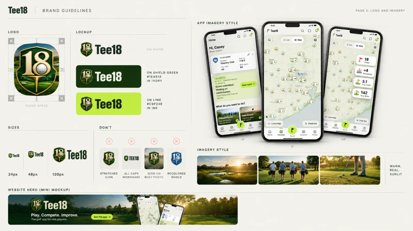
The gold 18 with the ball in the 8 and the tee below, on a forest green shield. The wordmark is Tee18: capital T, lowercase ee, never TEE18.
 Tee18On Paper, Ink wordmarkTee18On Shield Green, IvoryTee18On Lime, Ink
 App icon: the shield on the course, for home screens and links
 Shield alone: at least 24 px tall, clear space of half its widthTee18Tee18Small sizes: the wordmark carries it
Don't
Three families.
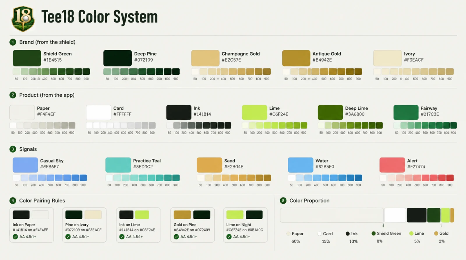
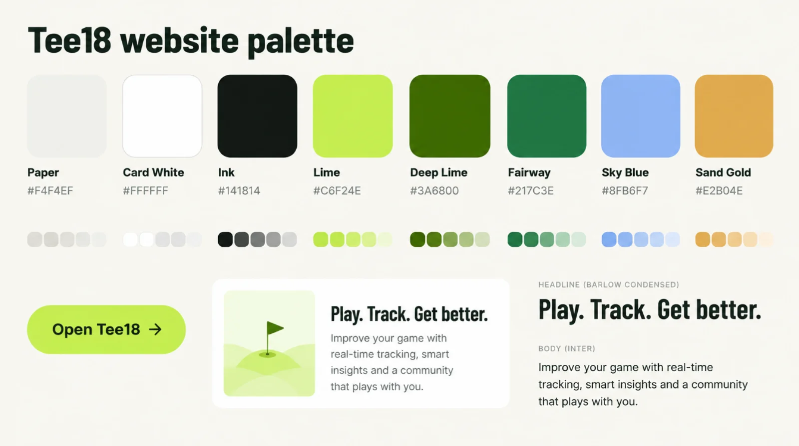
Brand colors come from the shield, product colors from the app, signals mark each kind of thing. Every color has a 50 to 900 scale.
Brand
From the shield logo (sampled from the app icon).
Product
The app itself, light mode (src/index.css).
Signals
Each kind of thing has its color, the same in the app and here.
How much of each
Paper 60% · Card 15% · Ink 10% · Shield 8% · Lime 5% · Gold 2%. Signal colors only where they mean something.
Text on color.
The pairs we use, all past 4.5 : 1 contrast. Lime is a fill, never text on white.
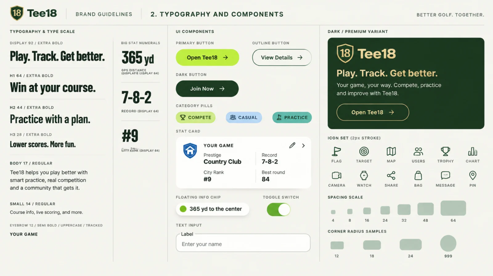
Barlow Condensed and Inter.
Barlow Condensed for headlines and the big numbers, like the GPS screen's yards. Inter for everything you read.
Buttons, pills, cards.
Cards and chips
Spacing and corners
An 8 px grid. Cards 24 px corners, sheets 28, buttons and pills fully round. Tap targets at least 44 px.
The brand boards.
Made with Higgsfield from the logo and the app's light-mode screens, as the first pass. Where a board and this page differ, this page wins.